 One of the very first things to consider while building a business website is to find a relevant domain name. The domain name will become your online identity. It should be memorable and catchy. Avoid straying away from your business objectives. The domain name should define your business services perfectly.
When designing the homepage of your website, you have to be objective. Instead of focusing on what you want, consider what your prospective customers need. This way, you can create a customer-centric website, which is as it should be.
Web designing is no easy feat. It requires a lot of effort, including creating readable and authoritative content. Once people used to spend hours reading an informative article. However, things have drastically changed over the years. In this fast-paced world, the readers’ attention span has devolved. They do not have the time to read a lengthy piece.
Visitors usually need quick answers to their questions. Instead of reading a big paragraph, they would rather read shorter sentences. It is the key to creating content that they can read quicker, making it easy to scan with the naked eye. So far, we have discussed a few common mistakes that people are bound to make when they remain unaware.
Let’s take a look at 15 other things to avoid when creating a website:
1. Not building the website for your target audience:
First and foremost, a business owner shouldn’t overlook the importance of building a target audience. It is essential to the survival of every business.
As a business owner, you are building a website to appeal to your target audience. These are the people who are interested in your services. In order to find the right target audience for your business, you’ll have to hire a marketing or digital marketing professional. They’ll be able to help you narrow down the overly-large audience pool.
To build a target audience business, you have to create a buyer persona. Refer to SEMrush’s Buyer Personal Examples to understand how a buyer persona works. In short, you have to build a profile listing the basic information of the ideal customer. The profile should also include pain points, their reason for buying the products, and what influences them to make the purchase.
One of the effective ways to narrow down the audience is to look at your existing loyal customers. Use the data collected from them to build a persona.
Suppose you run an agency that makes it easier for working parents to find a Nanny:

- Your target audience will likely be men and women between the ages of 21 to 40.
- You’ll also have to check if they have young children who need care while the parents are away.
- Some parents might also be looking for a live-in nanny.
- Also, find out how you can reach them. Do they spend time online looking for resources? Create a blog promotional content copy targeting this target audience. You could also create short-form social media videos for Instagram posts and use paid advertising to target them.
2. Having a disorganized website with poor navigation:
Building a website without a solid plan can lead to a disorganized website built with poor navigation. Although good website design guidelines warn people about it, these remain to be two of the most common mistakes in web development.
The best way to get ahead of this is to be organized in your planning and implementation. Do your research and look at the competitors. See what works for them. Improve those features and implement them on your website.
Build a user-friendly website with elements that are easy to find.
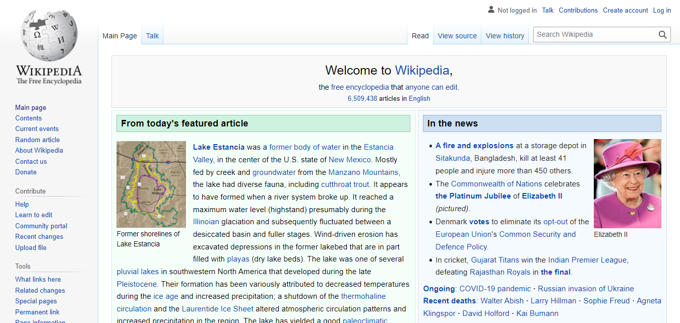
Example of a organized website with great navigational flow: Wikipedia
- The home page should remain uncluttered with only valuable information that holds attention.
- The search box should be in the places users usually look for. It should be on the top.
- Your business’s contact information should also be visible. Either create a separate tab for the contact information or put it in the footer of the webpage. It can also be permanently displayed on the sidebar. In the separate contact tab, you could also incorporate a contact form.
- When you add forms or other input fields to your website, make sure to ask only for the essential information. If it gets too long, the visitors will get frustrated.
Remember the Important elements in a website design. Depending on your business’s needs, you have to narrow down the functionalities your website can offer. These functionalities can be built for your website, or a web developer will use website plugins to make it work. Either way, avoid adding functionalities that add no value to your business.
3. Poor Resource Allocation:
Poor resource allocation is one of the most important things to avoid when planning a website.
Even if you are running your business out of your home or garage, for its optimal working, you’ll need to collaborate with other entrepreneurs and working professionals.

For example, people running a flower shop with technical knowledge will need to get in touch with a Website developer. They’ll also need an SEO expert, graphic designer, and content/copywriter.
At the beginning stage, it is essential to build an SEO strategy and brainstorm ideas to fill the website with valuable and authentic content. Allocating resources will not only take the weight off your shoulder, making sure you can effectively execute your website plan.
4. Not spending time on Competitive Research:

There are always things to learn from your competitors. Your competitor could be a newly established local store or the leading business in your sector. In order to beat an expert, you have to learn what makes them an authority in their field. You have to learn from them: their best wins and their terrible mistakes. It will ensure that you won’t make the same mistakes as well as give you an idea of what works with your target audience.
Read the reviews the users leave about their business. Find out what they like most about it. Find a way to use those to your advantage and create a better web design more suitable to your business’s needs. As we have already discussed, keep the web design simple, uncluttered, and easy to navigate.
5. Lengthy Page title and meta description:

If you search for our published content: 11 Actionable Ways to Speed Up WordPress Performance, you’ll find this search result, which provides limited information about the blog post. It means you have little space to create an impression.
You’ll notice that it is easy to see the page title and meta description in the search result. Neither of them is too lengthy. In fact, they are just the right length. If a visitor decides to click on the link, they know what they are in for.
Usually, publishers forget that a long title cannot be seen in search results. That puts them at a disadvantage with users. Users prefer to have access to the readily available information. Google’s featured snippets have increased the demand for authoritative and valuable content without fillers. It also has raised the expectations of the average visitor.
That is why it is essential to optimize the length of your web page’s title and meta description.
6. Not adding Image Alt Text:
Google Doc, one of the most commonly used cloud-based writing platforms, also allows users to add Alt text to the images they have uploaded. It is especially helpful when people directly publish their work from Google Docs.
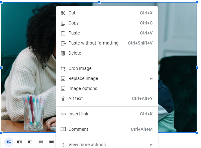
To add alt text to your images in Google Docs, right-click on the image and select Alt Text.
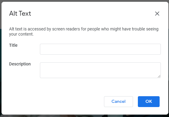
The following Alt Text dialogue box will appear. Fill in the title and description for the image and hit ok to save.
Why the additional efforts, you ask?
The search algorithm cannot read the images. It uses the Alt Text and descriptions added to understand what the image is about.
7. Optimize Visual Elements of Your website:

One look at the picture of two food bowls should help you understand the importance of high-quality visual elements. As you can clearly see, both are pictures of the same bowl. One is inferior while the other looks delicious.
Be it font, logo, or images your website needs to look authentic and professional. Poor quality visuals can negatively affect your website’s appeal. When you are allocating resources, find a graphic designer who can help build quality visuals for your website.
8. Not adding the much-needed CTA Button
CTA, short for Call to Action, are typically buttons used by websites to direct their visitors to a page created for increasing the conversion. A CTA button could lead to any number of pages: lead generation page, social media profiles, sharing content on social media, or event registration form.
For example, Hostingclues.com shares a review of the top 10 web hosting services in India. As it can be seen in the screenshot provided below, BlueHost ranks first on this list.
Hostingclues has added a call to action button Visit Now:
Instead of searching for Bluehost on google, the visitors can now directly use the button to visit the Bluehost website where they can make a purchase.

The addition of a CTA button added value to their website. You can find similar ways to equip your website with properly placed CTAs.
9. Not Incorporating Videos in your website:

According to Social Media Week, 78% of people watch videos online every week. The same statistics also state that 55% of people watch these videos every day. The importance of these two statistics is further enhanced by 54% of consumers who want to see more videos in the same year.
The growing popularity of these videos has also made marketing professionals take notice. Since they first noticed the potential of video marketing, it has grown. Now, it is considered one of the best ways to get great ROI.
Creating videos is a highly sought after skill. Unless you are an expert, you’ll have to find someone who has worked on websites for your niche. It will help them better understand your business needs and create videos that make waves.
10. Overlooking website performance analytics:

Analytics tools such as Google Analytics and Google Search console help you track your business website metrics. Both of these tools offer a varying range of metric tracking features, and it can get quite confusing. It is also time-consuming.
So, instead of tracking all the analytics, you could focus on the ones that work seamlessly with your business goals. Focus on metrics such as website load speed, page views, bounce rates, traffic sources, and the number of visitors.
This data can be used in several ways. It can help you find out the weak points of your website. You can immediately get those fixed. They can also help you better understand your visitors and find out how many are returning to your website frequently. In addition, this data can also be leveraged to help your business grow.
Issues such as slow website speeds are simple to fix if you know the ins and outs of your CMS. If you are planning to build a WordPress website, refer to our guide: 11 Actionable Ways to Speed Up WordPress Performance. Google has dedicated a separate tool for measuring website performance: Google Pagespeed. For more such tools, refer to our guide: 15 Best FREE Website Speed & Performance Test Tools.
11. Using Shady SEO Tactics like Keyword stuffing
We would again like to mention the importance of SEO in today’s competitive digital space. It is difficult for a website to organically rank on search engines when established websites with high authority already hold a place in the top search results.
This is where SEO helps. Getting in touch with an SEO expert can help you climb the ladder. They’ll also guide you to the right SEO strategies for your business and warn you off black-hat SEO techniques such as keyword stuffing.
Keyword stuffing is simply adding a lot of keywords to your content with the hopes of ranking higher. Excessive use of keywords spoils the reading experience. Often keywords don’t form meaningful words, and when used as they are, can change the meaning of the sentence. Keyword stuffing can get so out of hand that the users notice that the words are out of place. Hard to read text also puts visitors off, they’ll leave frustrated, which will increase the website bounce rate. Taking these factors into consideration, Google has also optimized their algorithm to spot websites that practice keyword stuffing. It penalizes and bans such websites.
Instead of blindly stuffing keywords everywhere in the text body, focus on proper keyword research. It should help you organically reach the top ranks.

You can use keyword research tools such as Google Trends, Google Ads Paid Keyword Planner, and Ubersuggest.
12. Falling Victim to Keyword Cannibalisation:
In-depth keyword research should also help you fix other SEO issues such as Keyword Cannibalisation.
Keyword cannibalization is an act in which multiple pages on a website target the same keywords. It doesn’t help the website grow but hinders any progress. It diminishes the page authority. It also sends people to different web pages, when you could have effectively led them to a landing page with maximum conversion potential.
Fixing keyword cannibalization is a lengthy process. You’ll have to restructure the website, build new landing pages, and find new keywords relevant to a particular page.
Here are 25+ Common SEO Mistakes That could affect your business website. Go through the list and make an effective plan to ensure that your website will remain free of these.
13. Not Optimizing the website for mobile devices:

One of the first things to consider when you are planning to build a website is a mobile-friendly website design. A responsive website is a must if you plan to reach a wider audience pool.
According to the 2022 Statista Study on numbers of Smartphone users worldwide, smartphone subscriptions surpass 6 billion and are predicted to reach over 7 billion in 2027. Based on this data, you have billions of users to reach. Even when you narrow it down to your target audience, that’ll still include at least thousands of individuals interested in your services. Not all of these phone users might use a computer or laptop. So, when you forgo creating a responsive web design, you lose all those prospects.
14. Adding too many or too few internal links:
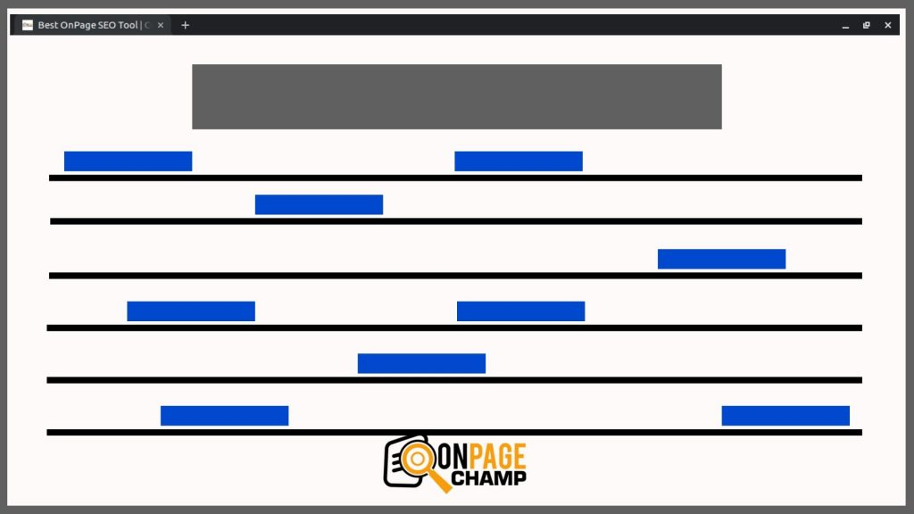
Image Credit: On Page Champ
Similar to Keyword Stuffing, adding too many internal links can be a bad strategy. It could affect the visitor’s reading ability by distracting them with all the links. While internal links are necessary for the optimal working of your website, they have to be smartly and sparsely used. Think of these links as your call to action buttons.
Most often these links lead readers to another resource on the website or a landing page that they want to visit. You’ll need to consider the optimal placement for these links so that the visitors can read the website content without any bother.
15. Disregarding website security:

Last on the list is another of common web design mistakes: Not taking website security into consideration. For some business entrepreneurs, website security can be as simple as equipping the website with an SSL certificate.
It protects your website data and boosts website speeds. The green padlock and HTTPS prefix also help visitors trust your website more.
There are several other ways to include website security in the planning stages. When you are looking for hosting, also consider web hosting services that provide DDoS Protection.
Conclusion,
Apart from these 15 things to avoid when creating a website, business owners should also focus on building a sitemap. It is one of the most common ways to structure your website for proper ordered functionality. It ensures that your customers are effectively guided to your services. A sitemap should be created before you start building the website.
Before you launch the website, check if there are any under-construction pages or broken links. Any pages that aren’t working can be added later. As for the broken links, consider fixing them as you find them. These two create a bad impression, especially if you are a new kid on the block.
Leave a Reply